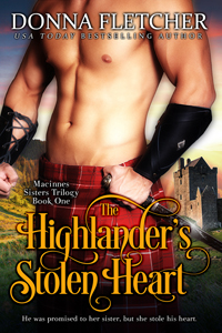
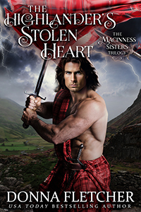
Book covers can help sell a book or kill a book. A good book cover can catch the eye and have the person reading the description and if that hooks you, you sample a few pages and you’re hooked, or not. But most times it starts with a book cover, unless of course it’s a favorite author and she or he is an automatic buy no matter what the cover looks like. A while back I asked about an older book cover that I thought might need updating… The Highlander’s Stolen Heart. It seemed that headless, bare-chested men covers were losing favor with romance readers. Many of you liked the cover and didn’t think it needed updating, but I got to thinking. You didn’t have anything to compare it to. So, I had a new cover done for it. Now I require your opinion again. Please leave a comment as to which one you like best! Your feedback is appreciated!
Original cover
New Cover


I like the Orginal best
I like the original one, nice abs.
Oooh… i was a dont change it vote… but i thonkwe do need the update…. it looks more sinister…. i vote that should be the dragons cover. Hahaha
I LOVE the new cover!!
I love highland stolen hearts ❤️ book cover by far
Both covers are interesting, however I like the new cover because it has action.
I still enjoy the original cover the best, it’s sexier
I love the new cover
Hey Donna, I have to say that I like both. If I had to pick tho I like the first one with the second one’s background. 😊
Definitely the new one !
My vote is for the Original cover!
Definitely the New Cover💞
I like the new cover better. I like seeing the heroes face. It gives me a better idea what he looks like.
Original cover, by a mile!
I like the first one but the new is dream worthy.
Well, I’m a designer… so I like different elements of each. LOL I like the art for the new cover, but far prefer the styling of the title on the original — it really POPS. If I have to pick one, it’d have to be the original.
The new one isn’t bad, but I much prefer the original one.
Love the orginal for sure.
Original
I prefer the original cover. The man in new cover looks more angry than sexy.
Agreed
I like the new one more
I prefer the original cover.
The original
I prefer the New Cover
Oh my they both get my blood pumping lolll.
I like the original cover. It gives you a glimpse of the hero but then when you read the book it fills in the blanks and gives you the details about him. And that is what I feel about your characters in your books, we are not meant to judge them until we know them. N.B. I did have an issue with “in the arms of the highland warrior” but I guess that was how I perceived the picture.
I love the second cover. It looks much better.
I like the new cover better. I like to get a visual of my hero and heroine. Then get upset if the picture doesn’t match the description in the book. Lol 😆
I love both covers, but that new one I so much more intriguing! I say go with the update!
Keep the first, imagination can fill in the rest. That said, the new one is very nice, how about later?
Tough choice but if I am being honest, I like the original cover.
I like both covers. However, the new cover is very eye catching and lends to the visual fantasy of the hero of the book.
I would have liked to see the heroine in the background as if the hero is protecting her.
My vote goes to the new cover.
I have an opinion on both. The new cover is wonderful, IF the Highlander didn’t look so much like Fabio with dark hair! Lol!
The original cover is sexy and it allows us to imagine what this man might look like as we form an image in our mind as we read the book! Lol!
My vote would be to change up the face of the man on the new cover and then go with that cover!
Whatever it turns out to be, I’ll love it regardless!❤️
The original!
I prefer the original cover
I would have to say I like them both. However my grip with changing covers is this.I end up buying the same book that has had the cover changed out. Then I get the new one and a chapter in it’s oh good grief. I’ve already read this book or own it.
I love the original cover the best. Don’t change it!
I like the original one better.
I agree, the new cover is great
I prefer the original cover. I like the yellow title and the manly chest. The new one looks like a recycled older cover of another author I follow.
I love the original! Don’t change it!
Both are strong covers and have good points. I like the color scheme, font, and layout of the title in the original; that yellow really pops against the red. I also like the castle in the background. I think I prefer the new one though as I like seeing the hero’s face.
I prefer the original one.
The original. No face. Sometimes the face on the cover doesn’t match the face that the writer creates in my mind.
I like the original one best.
I prefer the original!
Definitely the new one! Hot Scot!
The original, I like the chest.
I prefer the original cover
I like the original cover. Sometimes the model’s looks don’t match the description I the book.